Portfolio and Artist Statement
1- searching.
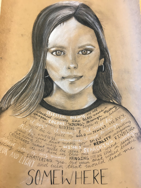
|
The quest to my final charcoal self portrait was a difficult yet rewarding one. Through the use of white and charcoal pencils I was able to practice using various elements of design, especially focusing on value and composition. It was extremely challenging to create a drawing based off of precise measurements within a smaller-scale photograph of myself because every element had to be exact or else the entire piece looked nothing like the photograph. I have never worked with charcoal before so it was both an exciting and intimidating opportunity to utilize what little knowledge I had on the subject and apply it to a brand new medium. I was able to master the idea of blending, however, I struggled with using the charcoal to draw facial structures. I drew inspiration from Scottish artist Douglas McDougall, who is known for his very life-like charcoal drawings. He pays attention to even the smallest of details and the resulting pieces appear as if they are photographs--demonstrating how he mastered both value and composition. The messages he conveys behind his pieces have much to do with conveying the brevity of life to an audience who often forgets this truth. In the beginning, I struggled with making the grid perfectly proportioned and let inhibition get in the way of starting SOMEWHERE. After this initial fear, I decided to try as hard as possible to draw what I saw, which meant choosing where facial structures go based entirely on the photograph. Over time, many small adjustments were made: my hair became darker over time, my ear needed to be shifted up, my chin needed to be completely re-composed, and my face needed more white where light hit my face. I wish I could do my hair differently because it looks 2D rather than 3D, which makes the drawing look flat. If I could do it over again, I would add white in earlier and add more body to the hair so that it looks more realistic. This piece is about searching--finding myself in a world of confusion by truly understanding the type of person I strive to be and how my past has shaped me into the person I am right now. In this time of change and self-discovery, I am gaining a greater sense of how I fit into the puzzle pieces of the world and how I can contribute to it.
|
2-creating.
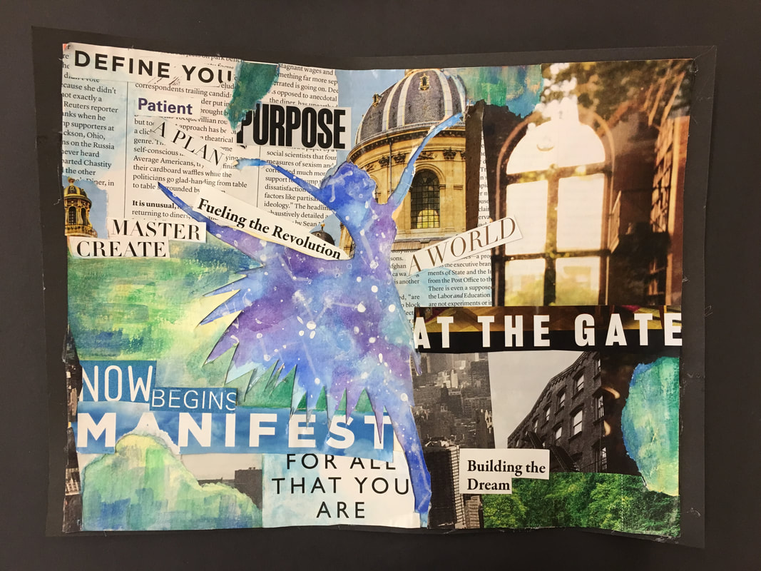
I used many different watercolor techniques, and some were more successful than others when creating this piece. I had very little experience with dry brush, so it was challenging to find the balance between having the paint brush be dry enough to still achieve the desired effect and wet enough to put color onto the page. As seen in the green, blue, and yellow sections shining through the images and words in the collage, the colors didn't all blend together perfectly, and there wasn't a consistent pattern of brushstrokes that I used throughout. However, I appreciate the imperfections and how each section is a bit different from the others because it further portrays the message of the piece. However, I tried using a variegated wash in the ballerina cutout, and this turned out very well. The colors blended together nicely and I had no issue with the paper becoming too watery. I have long admired famous Parisian water color artist La Brige's work, and here I tried to channel the effects that he uses in his pieces to portray certain messages. I played with color the same way he does: putting emphasis on parts of the piece by using brighter, more vibrant colors, and using duller colors to add to the background components of the overall painting. I also played with composition in a similar way that he always did: placing the aspects of the painting that hold the most importance towards the center of the painting while having everything else out to the sides. However, I made it purposefully unsymmetrical, unlike his constant use of symmetry, yet tried to mirror his mastery of unity; the whole piece seemed to connect, even though the separate components were extremely disjointed. His work was inspiring because it shows the historical context of Paris in the early 20th century, while also representing the time of year in which the painting was created. This, combined with the way he transports the audience to the location of the street, castle, or boat that he portrays, is unlike any other watercolor paintings I have ever seen. At first, I decided that I wanted to merely paint a ballerina galaxy, but I later decided to cut the ballerina out and put it on top of a galaxy painting because this gave the piece more dimension. Then, I originally painted a sunset on the piece on top, which was initially blank. I decided that this held little meaning, and changed course to cut out important words or phrases from magazines that aligned with how I have been feeling recently. Overall, the final product was a cumulation of many re-writes and changing of course, but it was all the more gratifying to have it end up being something I didn't expect in the first place. If I could do this project over, I would add more to the galaxy in the background, possibly adding more 3D aspects (like stars that come off the page) or even glow-in-the dark paint. This would make the focal point more engaging and unique. This piece is meant to show the position I am at in my life right now: almost stuck in an in-between, not quite a kid, not quite an adult, phase. I am "at the gate" of the world, digging deep inside myself to find how I want to contribute to the community around me, confronted with endless possibilities. It shows that I am searching for myself and how I fit into the broader puzzle of the universe.
3-thinking.
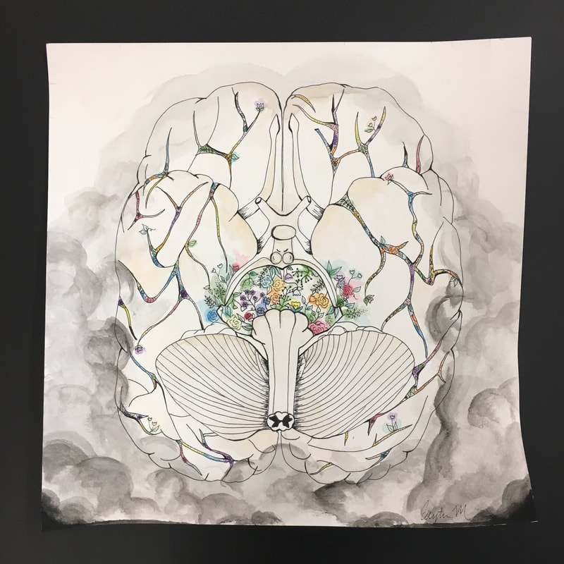
Before creating this piece, I had never attempted to create something as technical and precise as this endeavor. After finding a proper reference photo and studying it in depth, I began to gauge just how important each small brushstroke would be to the overall realistic appearance of the piece, and for me, the more realistic the better. I began to outline and sketch with a normal pencil on watercolor paper, and once I was content with that foundation, I was able to go over each line with a black sharpie pen. I was able to master this technique after about a day of doing so. However, some of the techniques used above were not as easy for me. Creating the clouds of smoke encroaching on the brain at the bottom was incredibly difficult to achieve because the watercolor paint did not always travel to where I needed it to. I tried creating a wet-on-wet technique by putting water down before adding color, but this became tricky because sometimes too much water created pilling of the paper. However, after much practice and trial-and-error, I was able to reach my desired effect and the outcome was similar to how I originally envisioned it. The work of Angela Palmer fills me with complete and utter awe and wonder. She is an artists who describes her work as "mapping" the human body, as she charts the geography of the human body using thin layers of glass on which she paints detailed biological topography. The medium she choses to do all her work with (paint on glass) is highly intriguing to me personally because I have never seen an artist use those tools to create pieces as detailed, realistic, and engaging as Palmer. Much of her work seems to demonstrate our human existence in terms of the brevity of life as well as the miracle that is our existence, which shows through in the way she highlights aspects of our biological make-up. Within my own piece, I made many choices that ultimately combined to form the piece shown above. Originally, I had no idea what I was planning to do. All I knew was that I hoped to draw an anatomically correct brain, making it hyper-realistic by carefully drawing lines where gyri and sulci connect, and structures of the brain can clearly be seen. Based on the reference photo, my whole goal was to make the brain have the same size and shapes of structures, have similar spacing in between elements on my paper as in what I saw in the photo, use my own creativity for where the lines in the brain went, and utilize the idea of direction by ensuring the focal point of the piece was in the mid brain. The mid brain has a garden within it because in the human brain, the part of the midbrain that connects to the hind brain (where autonomic functions stem from) typically involve processes such as memory, regulation, hormones (interaction with the rest of the body), and behavior. The garden there was supposed to demonstrate the ways in which we as humans can cultivate and grow each of these aspects by being a force of good in the world. Later on, I decided I wanted the flowers to continue through the lines in the brain to show how it is pulsating with life and that this garden we can grow is the "livewire" of our existence. However, if I could do the project over I would make the flesh color of the brain more apparent to increase the realistic nature of the piece. Next time, I would make the color there darker and spread it throughout the entirety of the brain. This piece symbolizes how the negativity in the world, as shown through the grey storm clouds, is starting to affect how people view the world and how they view themselves fitting in to the equation. We are starting to gain a more negative depiction of the world, discounting all the beauty remaining that we can cultivate and grow off of in order to continue beautifying our world. The goal is to send a message that we are not too "small" or "helpless" to have a positive impact on the world, and that if we do not start changing this mindset, the darkness will take over. This piece is similar to the others I have created because we as humans should be searching for the good in the world rather than the bad.
4- dreaming.


Since this was my first time doing photography, I used many different techniques that I have never tried before for this piece. I used portrait mode to create a sharp focus on main elements and focal points within the photographs. At times, I tried to increase the aperture to blur the background. I seemed to master how to focus the camera in portrait mode in order to gain the desired effect, but I struggled with the movement setting on the camera. I hoped to get images of some of my peers in ballet poses, but I wasn't able to gain full control over the camera setting that entails continuous shooting and shots in motion. There are many great ballet photographers from which I gained inspiration, but my latest muse is a professional ballerina and a ballet photographer who goes by the name Darian Volkova. She travels around the world and takes photographs backstage at professional ballet company performances, often using interesting angles, lighting, highlights and shadows, and saturation. She mostly plays with angles, taking photographs above, head-on, or even below dancers. The messages she conveys about how the glamour and beauty of dance masks the hard work and adversity that lies behind the art form are incredibly strong, profound, and evident in how she photographs the "behind-the-scenes" and "hidden" aspects of ballet. I hoped to draw inspiration from the angles she demonstrates in her pieces, also photographing in an almost pitch-black environment by using the flash. At the beginning, I wasn't sure what I wanted to do for the project or what I wanted to convey. Then, I decided that I had a beautiful composition right in front of me: the annual performance of the Nutcracker. My ballerina peers were at their utmost prime: wearing tutus, pointe shoes, and practicing choreography backstage. I started with getting some blurry pictures to test out the effect it would create in terms of the background and the implication of movement. I ended up keeping one of those and putting it in black and white to show more contrast and the tiny details of the costume. Afterwards, I decided that I wanted to put the camera in portrait mode to highlight one focal point in the center of the piece, keeping the colors bright, the background dark but in focus, and the composition symmetrical. This can be seen in a few of the photographs. I tried taking photos from above, which can be seen in the photo that follows the rule of thirds, has detailing on the floor, and emphasizes the backstage black-light lighting. I took a few candid photos, and a few on the ground of dancers' feet in front of a black curtain. I tried to practice the rule of thirds, blurring and focusing, use of color or lack thereof, increased contrast, and the use of symmetry and asymmetry. I also emphasized texture and lines, as the costumes had a lot of detail to capture and the dancers' poses were extremely precise. If I could do the project again, I would have attempted the movement setting/continuous shooting in order to capture movement of dancing. This would help better convey the message I was trying to convey: finding what "sets your soul on fire" can hurt, whether that's in terms of the countless hours of hard work you put into it, or when you get rejected, but it's ultimately what will guide you through life. Your search may never be over, because we are always finding new dreams and achieving and failing and learning and growing. But searching for that dream is all a process, and even the product is a process, and that process will make you better. It's the "growing" aspect of finding the dream that's important, and the rest is merely encouragement to keep searching.
5-imagining.
The concept of blackout poetry always made sense in my head. I knew just where to start: picking out words to form cohesive poems that sparked something inside of me, a feeling, a memory maybe. And I knew I would have to black the rest of the page out. However, I wanted to take a different route than an ultra-fine, black sharpie: acrylic paint. I have never worked with acrylic before and it was initially very challenging. The paint would not be contained by the lines I drew, the colors were streaky, and I even had to mix paints to achieve the proper shade of green. However, I eventually gained a handle on how to use it to best convey my intention of the stained glass window light breaking through the dark. Austin Cleon is an artist who specializes in black out poetry and has many pieces that only contain a few words. These few words always carry a lot of meaning and contribute to an overall theme even more effectively than any long poem could. His work inspires me to pare my message down to a few words, only extracting the best and the brightest and attaching symbolism to each separate piece. Poet e.e. cummings also inspires me, more on the writing front, because his work is often very open to interpretation, engaging, and different grammatically and content-wise from any other poet I've read throughout my childhood and writing education. I attempted to disband normal grammatical rules and instead use the power of paint and well thought out poetry to emphasize the ideas of making plans for life and recreating them a million times over to fit the times. At first, I wanted every poem to have a different door on it to symbolize the many opportunities that arise over the course of one's life. Then, I switched my idea to paint a continuous stained-glass appearance over the poems, drawing geometric shapes on each one. I finally came to the conclusion that it would be best to have the outer edges be colorful and the innermost poems be black to create the effect of light and color slowly encroaching on darkness. The shapes were quite random, which I think was the best course of action because it feels very natural and the pieces flow together better than they would had I planned the shapes too much or too perfectly. If I could do something over, I would love to use watercolors instead of acrylic paint by transferring the poems onto watercolor paper. I was messy with the acrylic paint technique and the final product would have turned out better had I used a technique that I felt more comfortable with. This piece demonstrates, both through the poems and the painting, that one's light and color can punch holes in darkness and inspire others. We are all searching for ways to be that light, that color, that window in one's dark cellar of experiences, and that searching begins with making plans: plan A, B, C, D, and so on, as long as the prior plans don't work the way we expect them to. These plans help us gain a sense of self and understand how we can contribute to the lives of those around us.
6-exploring.
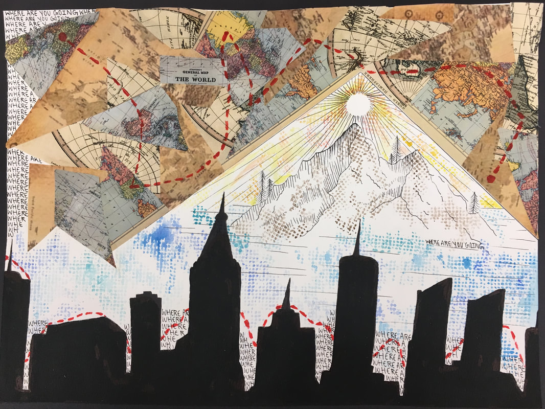
I attempted using three five different mediums for this piece: magazine collage for the top, sketching for the mountains, water color overlay, acrylic paint for the line and skyline, and the use of words throughout. The layers required much careful thought and planning, and didn't originally work the way I anticipated. I had to spend a lot of time on the acrylic paint for the skyline because I don't have experience with that particular technique. The edges were quite messy originally and required touching up using a smaller brush and a sharpie. The use of a screen when doing water color created a very interesting, almost pixelated effect, and I learned to master the variation between shades of blue and intensity of color. I really drew inspiration from Robert Rauschenberg, an artist who is well known for his use of collages in his pieces. He takes images and paints around and over them to create holistic, harmonious masterpieces that often behave as social commentaries. My favorite piece of his is titled "Estate" and was created in 1963. This piece has photos of New York buildings, the Statue of Liberty, and street signs--all connected by bright, primary colors that he painted on the canvas. I tried to incorporate the same ideas--colors that stand out, city scape elements, and juxtaposition of nature--while still using my own, unique artistic intent. Originally, my piece was only the mountain sketch in pen. Then, I decided to add water color by painting the paint over a plastic screen. Next, I printed pictures of maps, cut them up and pasted them on, and added acrylic paint touches. I didn't add the words until about a week after finishing all the other mediums because the need to fill the space with a meaningful message didn't occur to me until much later. This delayed realization made my piece feel finished, finally. Before the words, "WHERE ARE YOU GOING," there was still a lot of blank space that was intentional to show the map slowly being laid out. However, the words were put in that space to show that the constant pressure to know where you are going is being slowly buried by the joy of the quest and journey. Next time, I would make the mountain more straight and the triangle around it centered. I would also make sure that the yellow and orange water color that I used for the sun were purely warm and did not have green tints as a result of mixing with other paint colors. The main goal of the piece was to emphasize that from urban to rural, cities to mountains, we are all encoding stimuli, much like computers code information through binary code, and exploring new ideas. No matter where we go in life, the part that actually changes us for the better or worse is that act of searching and discovering, not where we end up or the many, stressful, pressing inquiries about where we are going. That is for individuals to decide for themselves, not for others to decide for them, or pressure them to find before they are prepared to. The world waits for the gifts of individuals, and sometimes individuals have to wait for the world. But when they are ready to begin the search, or continue the search, or conclude the search, they will know exactly where they are going.
7-trusting.
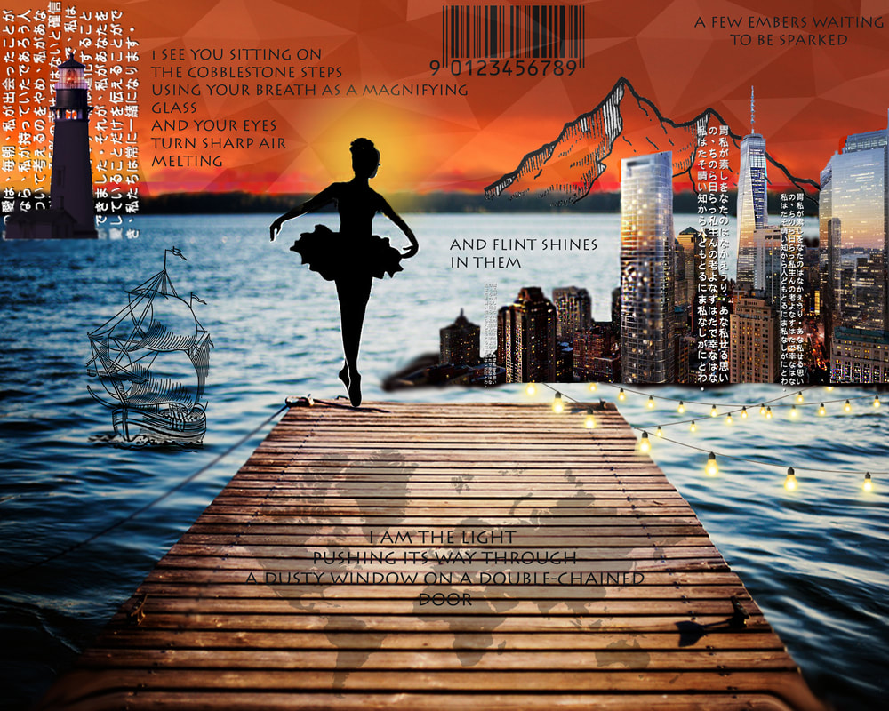
Photoshop was truly an invaluable experience for me. Through trial and error, experimentation, and hours of work, I finally was able to navigate the basic shortcuts of photoshop. While I initially struggled with basic functions and tools, I quickly learned how to resize elements, create masks, do overlays, use text, put filters and adjustments on photos, create and combine layers, and use my creativity and imagination to create a piece that surprised myself at the end. The work of artist Max Asabin was incredibly inspiring to me because his level of expertise and extensive knowledge of every tool and shortcut on photoshop acted as a good model for me as a learning artist. His use of composition by blending lighting, shadows, and colors of multiple photos within layers shows through in each of his finished products, which are all unique and indicative of his immense work ethic and creative outlooks on what art should be and what it means to him. The way he uses value and contrast to transport the audience into ambient environments in fantastical and magical landscapes is unique to him, which encouraged me to step outside of "normalcy" and my zone of comfort. While my piece was once simply a dock into a lake, I placed many, many layers over this background, no matter how out of the ordinary or wild they were. This began with the city coming out of the water, which was followed by the boat, dancer, and lighthouse, and then the sky, words, lights, world, and color around the dancer's head. I tried to create balance by making sure neither of the two sides had more elements or layers than the other. I also attempted to create a common thread approach, where the words were used on both sides of the focal point, the dancer, and lights in many forms were utilized repetitively: in the lighthouse, the string lights, around the dancer's head, and shining through the windows on the buildings of the city. I decided to use my own writing in the piece, which is why a part of a poem I recently wrote is split into sections all over. If I could do something over again, I would consider playing with the text more rather than making it all in line. This could mean splitting up the words and incorporating the letters into the background and elements within the foreground. I would also blend the city into the water more so that the buildings look as if they're actually a part of the scene rather than being a separate layer, creating more of a cohesive effect compositionally. I wanted to convey the idea that each and every person has the ability to be the light, pushing through any adversity, locked door, or dirty window...and that one has a choice to do so. In a world of dark, individual embers must be sparked in order for a wildfire of change to roar across oceans and mountains. The dock into the water is symbolic of taking a leap into the unknown and trusting that the universe is leading you where you need to go. The dancer shows a dream and the fact she's on the edge of the water of the unknown emphasizes the need for trust when breaking free from concrete reality and into the world of dreamers. The city is where I see myself going, and the lighthouse is the people in my life guiding my way...my way back home, my way to the future, my way to helping heal the world.
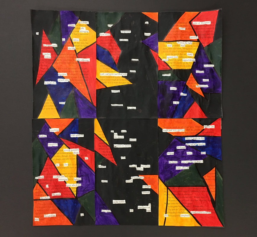
8-traveling.
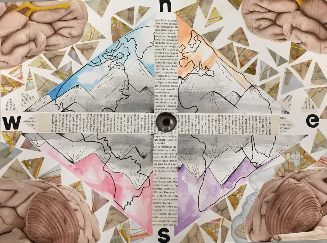
Originally, I struggled with finding ways to incorporate all of the media I had: the magazine writing, the anatomical brain diagram, and the other photographs of the veins and ventricles of the brain. However, after sketching the mountains and determining a pop-art approach with four triangles and bright, vibrant colors, I saw how the bolder magazine elements could fit into the softer watercolor and nature-focused 2D art. Finding how to use repetition, balance, symmetry, and color to create a piece that would be jarring and different from any collage I had previously attempted was difficult, but through this struggle I mastered these techniques. Elizabeth Zvonar is an artist based out of Canada who works with mixed medium collages, which is exactly the goal for the piece above. I gained inspiration from her use of impulsive and flamboyant colors, off-putting focal points, human anatomy, and recurring patterns. While I researched many artists who devote their life's work to multi media collages, hers stood out to me in particular because it captured the essence of human nature in its rawest form: the color and brightness within but not exposed to the world, or vice versa, heavily contrasts one's inner or outer artist. At first, I wanted to paint a safe watercolor, one where I couldn't possible mess up or have to adjust when faced with adversities. However, this rapidly changed when I found a diagram of a brain, which was subsequently cut into triangles, and the compass formed in regard to the magazine words. I chose to use triangles specifically because the three points represent oneself, one's work or art, and the broader universe. The words create a contrast from the color in the triangles, where the stark juxtaposition between the white background and black words further emphasizes the colors surrounding them. Shapes and chaotic formations were used to show the entropy of the world and how we constantly sort and categorize to make sense of it all. The eye in the middle and the brain in the corners represent how one fits, almost like a puzzle piece or a gear in the clock, into the world, which is represented by the mountains and the world map overlay. The compass shows the tools we use to navigate life. If I could do the piece over again, I could have blended the colors behind the mountains together so that the piece is more compositionally harmonious. I could have used a color pallet that would have made the world appear to be more distinct and stand out rather than blending into the mountainous background. Through traveling and exploring, one can better understand themselves and also self reflect: peering into their own consciousness to self actualize--the highest rung on Maslow's hierarchy of needs.
